10 October 2018

Design on a Macadamia Nut- Sized Budget: Free Art!

The NY Public Library has always been a rabbit hole for me.... whether browsing the shelves of books to read the spines or wandering aimlessly in awe through the reading rooms of the Fifth Avenue branch to stare at the magnificent architecture. 

And now, hundreds of miles away in the islands of Hawai'i, I still feel at home, getting lost on their images database (NYPL digital collection). It is an online treasure chest of images, manuscripts, cartography and illustrations that turns my decorating impulse into overdrive.  
They have nearly 200 thousand images available for use in the public domain- fish, birds, mammals, plants, ferns, mushrooms, maps--  absolutely everything! All copyright free and able to use for anything-- business or pleasure.  
 To bring a little of that NY spirit to the Big Island but still keeping in theme, I went on a glorious, time-sapping twisty-turny hunt for Audobon-theme artwork for my master bedroom. After a few days of deliberating between octopus (too scary- leave it for the bathroom) or botanical nut trees (too on point) I found my theme. Birds of Paradise and Peacocks! 
I emailed the the links to the images I preferred to the local printer (that's the free part!) and had them download the images at 300 pixels (the images are also available larger and up to 750 or 1250 pixels depending on the picture you choose).  I had them  printed out onto a gloss thick photo paper (that costs about 15 cents a sheet). 
I bought double matted  frames and hung them on either side of the bed and when I walk into the room I let out  a happy sigh knowing a little part of New York sneaked into the Hawai'ian home and nobody knows but me! 


09 October 2018

Sober as a Judge

America was captivated this week with yet another gripping court drama that could have been written for a bad episode of Law & Order. Our democratic system is messy, it's mean, it's anything but boring-- with political mudslinging, character assassinations, defendant deceptions and colorful alibis. yet all this treachery and vilification and backstabbing happens in a very plain, boring place. 
The interior design of a courtroom is as sober as a judge as they used to say (that metaphor doesn't quite work as well since one of our supreme judicial leaders ranted about his love of beer). Wood paneled jury boxes and witness stands and long tables for the defense and prosecution teams face the raised Judge's box. There is no color, no fun, no lightness or cheer when one's fate is on the line. 
So we can all agree that the design of the court, at least, is sober for sure, with its plain wood tables and puritanical benches. Every courtroom is more or less the same layout and design on or off tv, so what is the psychology behind the stark look and strict seating arrangements of the teams?

We in the USA are (all too) familiar with seeing the defendant seated at a long bar-desk alongside their legal team. Our courts have found that this is the best way to avoid giving the impression of guilt and our Supreme Court reinforced that decision in 2005, stating that any form of visible constraint violates the presumption of innocence.

However, in Europe, the UK and Australia, defendants are seated in a glass or open dock. The concept was originally conceived in the Dark Age to protect judges and witnesses from intimidation. 


And in Egypt and some Middle East countries, the defendant is placed in a literal cage.
Common sense would tell you that placing a defendant in a cage may sway a jury and a recent Australian study has found the same. Visual bars or glass walls that enclose the accused are more than a trick of the eye, but they are, in fact, an interior designed presumption of guilt. 
By putting the courtroom architecture on trial, the study found juries were more than twice as likely to convict a person sitting in a glass dock compared to the US-style bar table. 
When seated at the bar table, 36% of the 407 jurors found the defendant guilty, whilst 47% and 60% found the same person guilty when seated inside an open or glass dock respectively.   
So however we perceive the state of  our court system-- sullied and disgraced, drunk with misogyny and bipartisanship or still a little bit respectful--   it is, in one way, balanced in its visual design and interior makeup.  It may not be a handsome room, and the juries and judges may not be impartial to the facts, but at least it's designed to be fair. Let us rest this case. 


02 October 2018

Design on a Macadamia Nut-Sized Budget: 70's Bamboo Lamp

My Aunt Fay gifted me an appreciation for all things vintage. Her bespoke midcentury modern mahogany sideboards, stacked stone fireplace, and velvet sofa had me dreaming of one day furnishing my own home just like she had. The piece that mesmerized me most was her 1970s multicolored hanging swag light. 

Now living in Hawai'i, and trying to decorate my lanai and home on the earnings that a small macadamia nut farm will allow, I spend many days scouring the local antique and vintage shops. Browsing through one of my favorite stores, I looked up one day to find a piece that paid Aunt Fay's swag light homage whilst keeping with the earthy, islandy Hawai'ian tradition.  
A 1970's vintage swag pendant made of bamboo!
I gasped with excitement and pointed to the ceiling where it hung in anticipation of my husband's agreeing exhilaration of the find.  

But he just shrugged and said "I don't think the brass would look good on the lanai". 

I let it go. I thought. But I found myself stopping by the next day, just enquiring about the price. $125. That would make the lamp the most expensive purchase so far. 

It never left my mind and I would check up on the lamp each time I drove by to make sure it was still there. I began speaking with the owner, Peter, about how I loved the lamp but my husband didn't. He told me I was welcome to visit it anytime I liked (unless of course, someone bought it).  

A few weeks after discovering the lamp, my in-laws from England came to visit. Not one to let this go, I made a deal with my husband. We would take them to the antique store to see the lamp and and tell them one of us loves it and the other doesn't. If they too appreciate the vintage beauty of it, we will buy the lamp and hang it on the lanai.  
We walked in. I pointed up. His brother and sister-in-law's jaw dropped when they saw the holes made of the bamboo pattern and brass chain swag. 
I told Peter the owner  about our little bet and he seemed almost as happy as I was that is lamp was going to a good home! I asked if he could do anything better with the price to make the loss of the bet easier for my husband. 

He said I could have the lamp for $75!  My brother-in-law and husband hung it up that evening and it remains hanging stoically in the front of the lanai.


19 September 2018

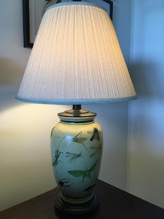
Design on a Macadamia Nut-Sized Budget: Bug Out Lamp

Decorating the farmhouse in Captain Cook, Hawai'i on a macadamia nut-sized budget is an enjoyable sabbatical of merry scavenger hunting for me. I am attempting to avoid all 'regular" furniture stores and take advantage of the island's nomadic population. Many people fall in love with Hawai'i when they are on vacation and move here permanently on impulse. With no planning and research into what careers they can jump into (not many) and the cost of living (bleach at the grocery store is $4!! What??) They soon realize there's reality even in paradise, give up on the dream and hightail it back to mainland.

Unfortunate for them, but lucky for those of us staying behind, the cost of shipping furniture and home goods back to the mainland can give you a serious case of sticker shock. So, many pieces are donated to the several thrift stores dotting the back island streets. The shops are a treasure trove of gently used goods just ripe for the picking.     
One of my favorites is a large warehouse specializing in furniture and lamps, mostly resort furnishings that were binned by hotel staff during redecoration projects. Rummaging through one day, I found myself in a sea of lamps -- all gorgeous and all with price tags more than $150 but reasonable for their quality. 

I fell in love with one in particular-- a pale yellow one decorated with fine-handed bug illustrations-- like dragonflies, grasshoppers and locusts. I rushed to find the worker in the store before anyone else grabbed it. She was in the second building.   
Out of breath, I approached her and said, "You have a lamp in the other building with bugs all over it..." Before I could continue, she gasped "Oh my God, I am so sorry!" she kept apologizing, not allowing me to get  a word in. I didn't understand why she was so upset, the bug lamp was one of the most unique pieces I had seen.
I mustered out, "No. it's ok, I want it. How much is it?"  She looked at me with an eyebrow raised, questioning my sanity and finally, after the longest six seconds of my life, responded.

"$40" was her reply. 

I was shocked in the very best way, yet still confused with her outburst. I gave her the money and rushed to grab the lamp, heading to the car. Halfway home, still reveling in my bargain find,  I burst out laughing, finally realizing the misunderstanding-- that my description of this gorgeous lamp made her believe there was an infestation of insects crawling all around the beautiful lamps she had procured. 
I'm sure the woman searched the lamp building right after I left for any termite damage or blight of flies and quickly realized all was well, but she may never know how much I cherish this lamp. It now has a special place on my bedside table so I can see it every morning and chuckle about how I managed to get a fly-swatting good deal on it. 


10 September 2018

Where Art Thou?

When I was young, entering my older brother's room (when not forbidden) was like embarking on a journey into another decor macrocasm. I could admire a completely different design landscape worlds away from the neat, symmetrically hung framed photos and shelved Barbie-dolled collection on my purple walls. A blacklight Led Zeppelin poster and glow in the dark zodiac stars jumped straight up in my face when I walked in. His oh-so-impressive vinyl collection hung chaotically in wood milk crates against the wall. That was my first memory of his world-- what he chose to put on his walls. His creative eccentricity and anarchic rejection of contemporary artwork left an impression on me-- and my design aesthetic-- for years to come. 
Because my brother stuck his middle finger up to the conventional (and conservative) wall art wisdom of the time, I became a strong believer that art-- whatever the taste-- commands the room. It is the thing anyone coming over will remember most. I mean, even Neanderthals knew the importance and longevity of its memory-- each scribble on their cave walls made a statement that persisted through time. 

So why the bloody heck do so many of us regard art as an afterthought when we design a room?
I argue that art is indubitably the most important part of the room plan-- that wall art should be the first and main piece of your design and the rest of the room decor should, if not bow down to, at least accentuate it. 
What the cavemen (and my brother) didn't know, and we do, however, is that the number one most important facet of any room decor is, COLOR. It is also one that we ruminate forever over. 
The weeks-long enigma of choosing the perfect shade is a kindergarten-grade equation when you have first and foremost planned the art that will hang in the space. Use the colors in the art to choose the palette of the room. Picking a few shades out of the art will allow you to toss out a few hundred of the cardboard color swatches you lugged home from the DIY store-- and let the art decide if you should go for that red sofa or the grey tufted settee; or if the teal rug will work in the space.    

And like most things, when it comes to wall art, SIZE matters. Big walls crave big art. Don't be scared to bring in a piece that will take up a majority of wallspace. 

Art that is too small for the wall will get dwarfed. Art should be bold, make a statement, be a conversation in the room-- not cowering indecisively like it's not sure it belongs there. 

A statement like that will also provide the essential FOCAL POINT of the space, drawing all eyes upon the prominent wall.  
You can easily mix it up as well to add interest and TEXTURE to your room. Wall art is not banished to just flat art prints and paintings, it can be a schizophrenic mix of materials -- woods, plastics, metals or even bones can bring life to plain flat white walls.
Sculptures, taxidermy and organic materials are three dimensional and add depth and spirit. They allow the light and your eye to bounce off their layers, expanding the zone by adding eccentrically interesting surface areas as well as providing leaping off points for conversation.

When it comes to Color, Texture, Focus and Interest, wall art dominates the character building of your space, defining the room as designed rather than just functional. Reconsider using art as a postscript to decor and reimagine it as the important and most memorable feature of your space-- a kick-off inspirational piece that will conceive an incredibly intriguing and unforgettable room design. 

09 September 2018

Listen Up!

Nietzsche was right, "Without music life would be a mistake."

And so would an interior design plan that left out a listening room that allows you to escape into your vinyl-scented nostalgia of long-saved and treasured LPs.


As unique as your taste in music may be, however, a true listening room that will deliver the best soundwaves your way should be set up by a set audiophile's blueprint. These design rules may make the punk inside you pull out all your tongue piercings in protest, but will make for a better listening experience.


First, think of you and your speakers as one, with your favorite listening chair the tip of an equilateral triangle, with yourself, the left and right speakers as close to equal distance apart as possible. The tip of said triangle is straight between your ears-- so position the speakers at ear level, away from walls a little.

If, like Steven Tyler, you believe "everything worth doing is worth overdoing" and you bought seven speakers for a surround sound, then just build two triangles in front (the main speakers) and behind you, the two smaller speakers at your sides and the center speaker straight out on front of you.

Before you put the needle to the record, add some spikes on the bottom of speakers-- they will decouple the sound from the floor to minimize the bass rattle.

You never ever have to sacrifice good design for great sound, and should let your style vibes run wild and crazy and barefoot and free in this hedonistic room because a minimalist approach won't be best for sound quality.

I'm not saying you have to add a little country to your rock n' roll, but a few rugs or cork flooring  and a cushy sofa will help the way the music travels around the room, 

"The only truth is music”, said Jack Kerouac but we know we need a little more glam in our rock to design a perfect room.

02 September 2018

Raise the Roof!

During the minimalist-dominated decades that we've experienced in our interior design lifetimes, we've gotten used to slapping some white paint on our ceilings and calling it a day. The top half of our rooms were the forgotten child--to be not seen and not heard, to fade into the upper limits of non-imagination, as we vowed to never again look up come hell or high water (well, maybe water). But leaks aside, the ceiling became a place no designer dared to travel, leaving the largest space in the room devoid of dressing, naked and bare.  

But recently, we've grown tired of looking down at our shaggy piles and chevron weave rugs and yearned for a grandness that can only come from above. Facing the risk of a neck crick head on, we have finally noticed the highest echelon of room design--
The Ceiling. 

Giving some needed love and attentrion to the summit of our eye space is not a new design trend, but one clipped from the more luxurious of ages-- Versailles, Robert Adam’s homes in Scotland, Otto Wagner’s post office in Vienna, and Grand Central Terminal's astrological heights of grandeur rule the roadways of opulent canopy. 

To draw the eye to to the top of the room doesn't require you to forge "The Last Supper", as you dangle upside down from a scaffold. A statement that will bring down the house can be made with a much simpler gesture. 

To give your ceiling the design interest it deserves, its as simple as dipping a brush into a a graphic paint color...
 ...bringing out a headbanging shiny Metallic...
...sticking mirror tiles overhead to bounce the light around the room...
...or using wallpaper that either keeps in the hues of the wall paint or just extend the wallpapered walls up and over to the next level. 
Pimping out the upper part of your room adds intrigue to the forgotten space, allowing the eye to take in the entire room, leaving no part behind. The ceiling is the last of the interior design frontiers that will cap off your space in fashion. 


26 August 2018

You Can Take the Hipster Out of Brooklyn... Or Can You?

The super hip can only survive in a sub-universe of originality and distinction; remaining untouchable in their ironically independent expression of style and design. The problem with being the author of the constantly revolving redefinition of "cool" in the hipster dictionary, however, is that everyone, eventually, wants to be part of it. More people appropriate the look and join the hipster club until, alas, the synonym for cool quickly becomes a bad word. 

That is what has become of Brooklyn.


The borough that could once only boast about great views of Manhattan, has in the last decade, become a destination of its own; a shorthand adjective that defines a lifestyle; its own design aesthetic. 
The industrial, natural wood and exposed-antiquely lit open-spaced loft design has been adopted by coffee shops and retail stores around the globe.
And the hipster has been lost in its own ubiquity. 
Once a style of independent expression and creative re-use and recycle, Brooklyn-the-aesthetic has become a commercial cover band for overpriced eco goods, creating a homogenous, monotonous, travel culture where one can take an airplane half way around the world only to land in their own neighborhood comfort spot. 

It's expected artists will commune and share design ideas in places like New York, London, Paris, Sydney and San Francisco, but Brooklyn-inspired cafes have popped up in places like Ljublana, Slovenia; Minneapolis, Minnesota; and Krakow, Poland. 


This signals the destined end to the Brooklynization of interior design and will soon be the time we bid farewell to the reclaimed wood, Edison bulbs, and wrought iron fixtures that once defined a hipster location.
New Yorkers may remember when Brooklyn was just a scrawny, bullied, bridge and tunnel borough of the city-- when hooking up with a guy that lived there was "slumming it" for the Manhattanite chicster who just wanted a little more "rough" in her rough and tumble for one night. 

But years ago, when Manhattan was busy staring into its after-work Cosmo, Brooklyn grew up, grew a beard and donned some upstate Catskill-chic plaid clothing. Brooklyn looked super cute sipping his fourteen dollar lavender latte in the open-space industrial cafe and Manhattan fawned over its dirty, diy-skilled, lumberjack manliness that refused to conform to the grey concrete urban environment.


Brooklyn brought raw, organic materials into their walk up. It laughed at Manhattans' matchy-matchy sofa and loveseat sets and those thousand dollar analagous living room sets bought at one store. It leaned unabashedly against the exposed brick wall and stood proud amongst its rustic interior look. sans serif logo-ed signage and quirky wall art.
Its strength proved persistent and the look spread, soon over-taking the world. Brooklyn became a household name, its own logo on a hoodie. It's not Brooklyn's fault it was adopted globally so lovingly and widespread. It's a good look with a natural, environmentally proud design sense and I will miss it terribly. We just don't want to feel at home everywhere we go, sanitizing our travel adventures when we explore other cultures. That is how I feel when I leave Brooklyn now-- that I just  never left. 
But Brooklyn is nothing but hipster and hipsters, like a lizard that lost its tail, regenerate, reinvent and regrow. I know as a resident, I can sink into my coffeeshop's big distressed leather tufted armchair with my nitro cold brew, take a long sip and wait and see how my borough once again will reinvent and redefine interior design chic.
Digg! My Zimbio